Workshop 2008 - Maps Linking GPS and Lab Results
Archaeological Research Facility at UC Berkeley
PRACTICAL WORKSHOP
Working with Archaeological survey data in Arcmap 9.2:
Making maps that link GPS point locations with artifact-level lab data
Friday Feb 22, 2008
N. Tripcevich
If images are absent in the webpage below, please Reload the webpage and allow it to load completely.
Data used in workshop:
- UCB GIS Reference data (UTM): Cal_GIS.zip (23 Mb)
- ArcMap_Mapping_workshop_ucb.zip (15 Kb)
- Locs.csv: contains locations and UTM coords
- Locs.shp: shapefile version of the Locs.csv file
- Lithics_lab.csv – lithics lab analysis
- Ceramics_lab.csv – ceramics lab analysis
Note: These are not real data! These data files are based on real survey data from South America, but they've been relocated to false positions to an area where everyone is familiar with the geography and scale: the South-east corner of the UC Berkeley campus. The following exercise uses a table from Lithics lab analysis but the table from Ceramics analysis can be substituted.
I. Tabular data in Excel, to start off
Examining these in Excel
- Open, view the tables
- Look at field names in Excel, note that the column header (fieldnames) are simple text (ASCII, 8 char max)
- If necessary, export out as CSV (choose first CSV in Save As... File Format list)
- Close Excel
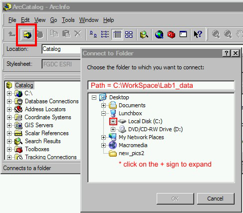
II. ArcCatalog
ArcCatalog is useful for managing data and transforming files to other formats
- Open ArcCatalog
- If the Volume containing your
data does not appear you will have to "Connect To..." path.- Create a workspace near the root of one of your hard drives
- Be sure the path to the data directory contains no Spaces. (Note: the Folder "My Documents" contains spaces!). Spaces and other irregular characters cause Spatial Analyst operations with GRIDs to fail.
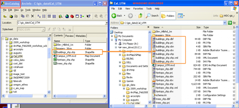
- Note that Shapefiles (such as Buildings_Shp) in Cal directory are only one file in ArcCatalog, but in Windows shapefiles actually consist of 4 or 5 files (shp, shx, dbf...).
- Right click lithics.csv and choose "To dBase (single)" to save out the CSV file in a format that we can use in Joins and Relates in Arcmap.
III. Organizing data in ArcMap 9.2
ArcMap is where most of the data exploration, analysis, and mapping occurs. The same toolbox functions are available in Arcmap as in ArcCatalog. In fact, we could have done the above step (CSV -> DBF) in Arcmap but I wanted you to see what ArcCatalog looks like.
- Open ArcMap by double-clicking on Campus_UTM.mxd (map document).
A. View UC Berkeley data
- Zoom and pan to ARF area using Arcmap Tools.
For your information, I got the underlying imagery and DEM data from the USGS Seamless Server.
B. Add Locs.csv file to map document
- why doesn’t it show in the Display tab, only in the Sources tab?
Answer: because only spatially referenced data appears in the Display tab.
C. Right click on Locs.csv and choose Add XY Data…
- Add X, Y, and choose Coordinate System (Projected, NAD83, UTM Zone 10 North)
D. These data become Events, which are spatial but they are not Shapefiles. They must be saved out to Shapefiles.
- Right click Locs_event > Data... > Export Data > Shapefile...
IV. Summarize in Arcmap
A. Relate (Or Join?) Lithics.csv to Locs shapefile
|
- right click on Locs > Joins and Relates... (choose Relate... from the menu shown at the right) |
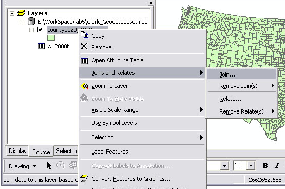 |
- The structure we're looking at using is called a One-to-Many (1:M) relate.
This is a powerful way to organize your data and explore relationships. To move between tables you use selections (highlight the rows in Blue) and then click Options... > Related Tables... > relate-name.
The associated records are now Selected in the related table using a LocID number. In this case "1004" links the two selections.

You can do a number of operations to your selection in Arcmap. Any analysis will apply only to the selected records, and if you want to copy just these records out into their own file at any point you can choose Export Data... and only those records will be exported to a new table or Shapefile. While it's tempting to export things out to their own files, it is a static and conservative approach. It is more flexible to structure your data dynamically through these kinds of relates because updates in one table cascade through your data sets. However, there are limitations to relates when it comes to graphical representation and thus we're going to have to move our data out of the Related Tables structure below.
One thing you can't do through a 1:Many Relate is Symbolize your Map data. In Arcmap 9 you still have to think about how to squash these down (Pivot and Summarize) to join the Many side of the relationship together into a 1-1 Join. We will now do just this kind of mapping process.
V. To link uniquely to Locs we must use a Pivot Table and then Summarize
A. Pivoting to match artifact data with spatial positions and then mapping those data.
Open ArcToolbox (Window menu > ArcToolbox).
Data Management > Table > Pivot Table
Note: You’ll want to use Input Fields: LocID, Pivot Field: Lit_Mat, Value: Wt_g
Licensing issue: PivotTable is only available with ArcInfo, the highest licensing level, not Arcview or ArcEditor. A much more powerful PivotTable function is available in Excel 1997 and higher. Archaeologists will benefit from learning the Pivot Table functions in Excel and learning this tool is highly recommended. If necessary, see this brief Excel Pivot Table tutorial.
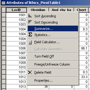
The resulting table has Lithic Materials as columns across the top and weight (gr) in each cell, which is what we want, but if you look at the LocID values you'll see that some of them (e.g., LocID = 1004) are still repeated many times. In other words, we still have a 1-Many relationship issue. To condense these on LocID to a 1-1 relationship (a join) we'll use the Summarize command.
|
Summarize: You still have multiple rows for a single LocID in some cases (a 1:Many relationship). We can collapse these into a single row per LocID by Summarizing on LocID.
Next, in Arcmap Attribute Table – Field Calc add up all Lithics in each Row -> Sum_Wt - Field Calculator is also where Cut/Copy/Paste occurs, and calculations.
Finally, we must use a Join to link these results to spatial locations.
|
 |
B. Symbolizing based on these values.
Open the Attribute Table for Locs and scroll to the right. Note that the results of your Sum operation (summary weights per Material Type per Location) are available in new columns added to the right of your Attribute Table. You can make maps using those values.
- Right click on Locs and choose Properties... then choose the Symbolize... tab.
- Choose Quantities and Graduated Symbols. Here you can choose Sum_Obs to generate symbols relative to the Sum of Obsidian Weight per context.
- Also try Charts > Pie Charts symbology. Here you can chose multiple material types and symbolize by the proportion of each pie in the chart.In this example you can see that the Chert (pink color) makes up most of the pie chart and Chert from that location weighed 144.9 gr.

VI. Convert to Raster for further mapping and analysis
A. How to generate contour lines based on these data?
You must interpolate to raster (GRID) then create contours and other surfaces. Rasters are generalized statistical surfaces, especially useful for studying patterns and representing trends. These can be viewed as 3D models in ArcScene or ArcGlobe, or used for mapping isolines (contours)
Rasters are cell or point based data. In terms of graphics software, think of Photoshop (pixel or cell based) as opposed to Illustrator or Corel Draw (vector based, object oriented). ESRI GRID is a proprietary Raster format.
Everything having to do with GRID (Raster) in ArcGIS is under the Spatial Analyst Extension or Toolbar. Make sure you installed Spatial Analyst and that both the Tools > Extension tool bar are turned on for these functions.
- Spatial Analyst Toolbar > Interpolate to Raster > Inverse Distance Weighted (IDW) with these values...
- Input settings: Loc, Z Values: Locs_Sum_Obs, Cell Size: 1, Output Raster: simple filename
Convert GRID raster to contours
- Spatial Analyst > Surface Analysis > Contour....
Rasters are good for statistical analysis based on a cell based model of spatial phenomena.
The following graphic shows a GRID of obsidian density (per m2) and contours (interval = 10) on top of that GRID.

VII. Distance calculations
Note that vector-based spatial analyses like point pattern analysis are available under Arctoolbox under Analysis
Many distance calculations result in Raster GRID surfaces. These include Euclidean Distance calculations and Cost Surface Analysis.
How do I calculate the distance from the edge of a polygon to a points scatter (Locs)?
1. Lets choose a polygon in the building (such as the outline of Wurster Hall in the UCB Ref data).
- use the Selection arrow to choose Wurster Hall visually.
- In the ArcToolbox under Spatial Analyst > Distance > Euclidean Distance...
- Choose Buildings.shp as the input layer
- Choose Locs as the Distance layer
- Name the output raster "Wurster_to_Locs"
2. To calculate the actual distance, use the Summarize Zones... command under the Spatial Analyst toolbar
- Summarize Zones where the Zones are Locs.shp and the Values Raster is "WUrster to Locs" GRID.
- Choose to Join the output to the Locs table. The output will contain the distance (in meters) for each record in Locs (each GPS collection location) to Wurster Hall.
VIII. Cartographic output
A final map was produced by going from Data Mode to Layout Mode.
- Click on the Layout button on the bottom of the map pane.This small button is important because it allows you to switch between between Arcmap data layout mode and page layout mode.
- Add Legend, Scale Bar, North Arrow.
- Right click Layers... > Properties, then click Grid tab. Choose Measured Grid to add UTM grid.
PDF files are a good way to distribute maps from Arcmap.
- users can zoom in on PDF files, and vector file format is preserved (unlike JPG, TIFF, PNG).
- output a high resolution PDF (400-600 dpi) to distribute and print.
- output an EPS file to place in a Word Processor for high res output to a Postscript device or PDF. EPS is a good format to use for map figures included in reports (theses) distributed as PDF or for publication.